DailyPay
Resource Center
Role
Product Design Generalist
Overview
The organization had undergone a full rebrand with the website redesign outsourced under tight deadlines. As an international contractor, I joined the team to help implement the update before becoming more involved as the staff composition changed. My first project in this expanded role was to bring the resource center into the new design while improving its usability.
Goals that guided the process:
- Give users control in finding their desired information
- Enhance overall scannability
- Make the large volume of content more digestible
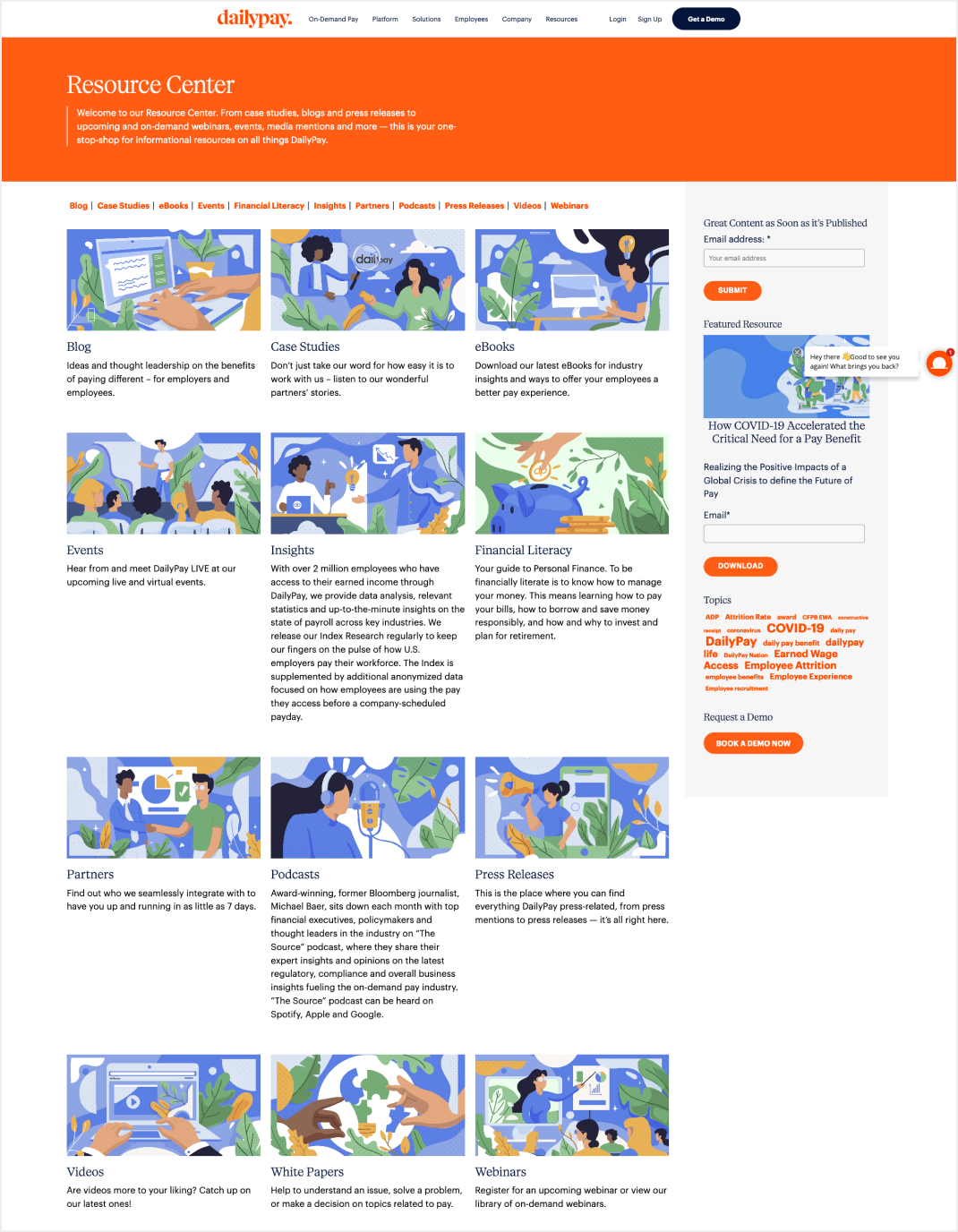
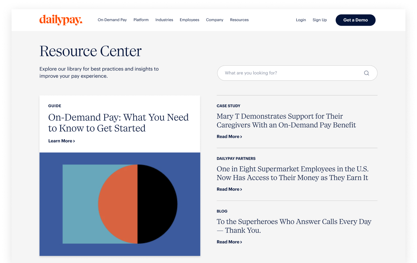
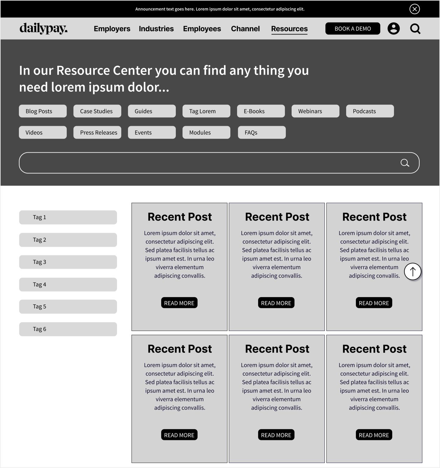
Before the redesign (left), the content was sorted by content type. With the implementation of a left-rail filter menu (right), the experience becomes more personalized and dynamic.
Challenges
The importance of a content audit
Much of the time was spent on the user experience that the content strategy was overlooked.
This was revealed through internal testings on the structure of the filter menu for the content categories and topics — a task that was outsourced and with much delay, fell into one of the last steps of the project.
Page results would return improperly tagged content and even displayed a unexpected empty pages at times. We learned that there were no set guidelines in how the tags are created, hence, the undesired results when the boxes are checked in the filter menu.
The first step of our solution was to limit the content uploads to one individual, the Web Manager. We also consulted our SEO specialist for keywords to bring into focus during the tagging process. An overhaul of the content review was a necessary next step to clean up the tagged properties in the resource center. Due to timing constraints, the tagging process still required further refinement.
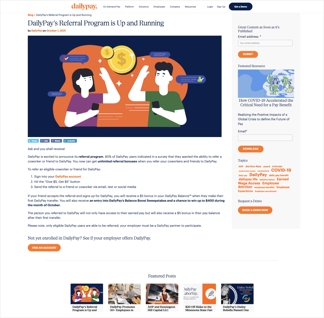
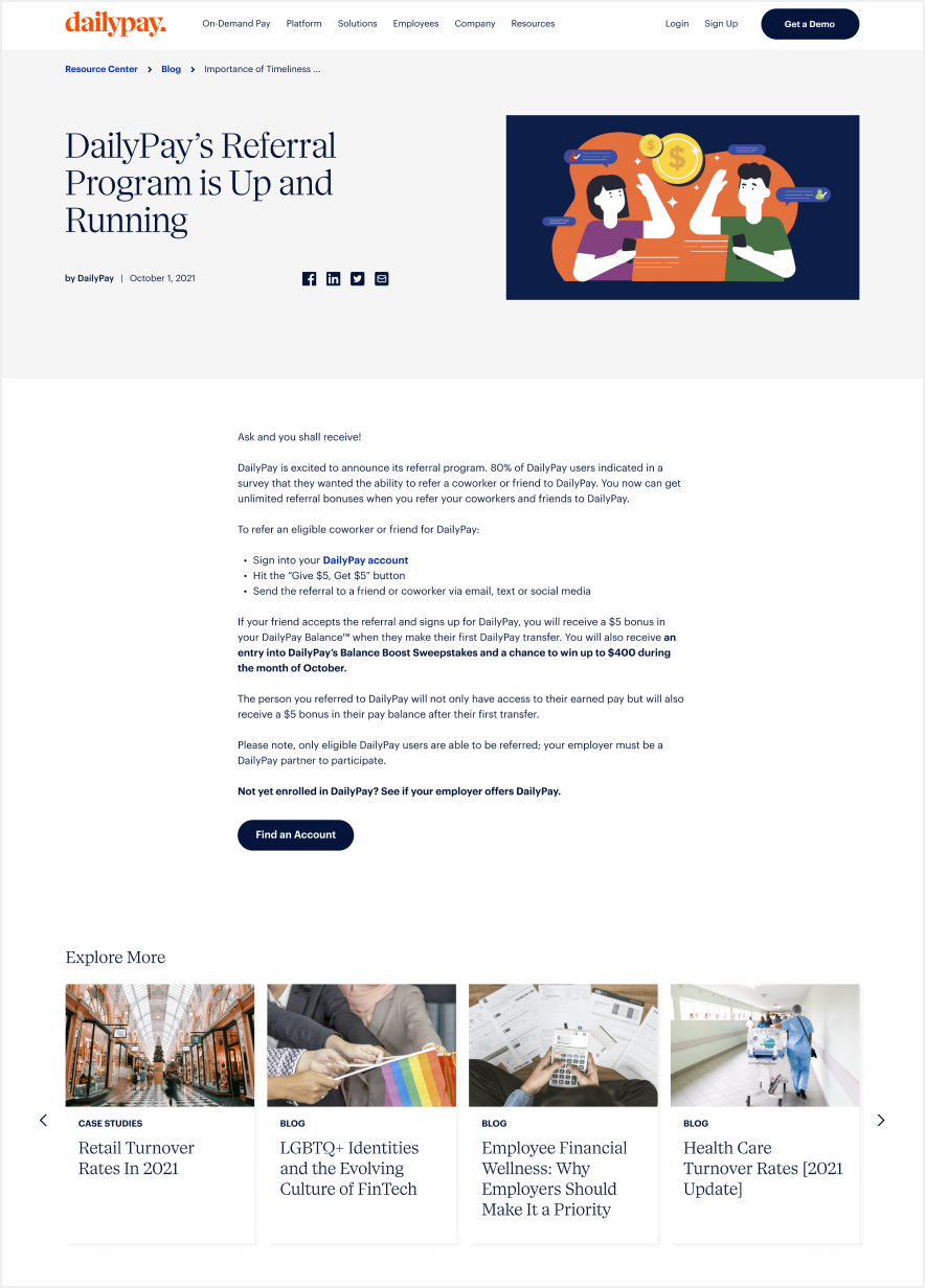
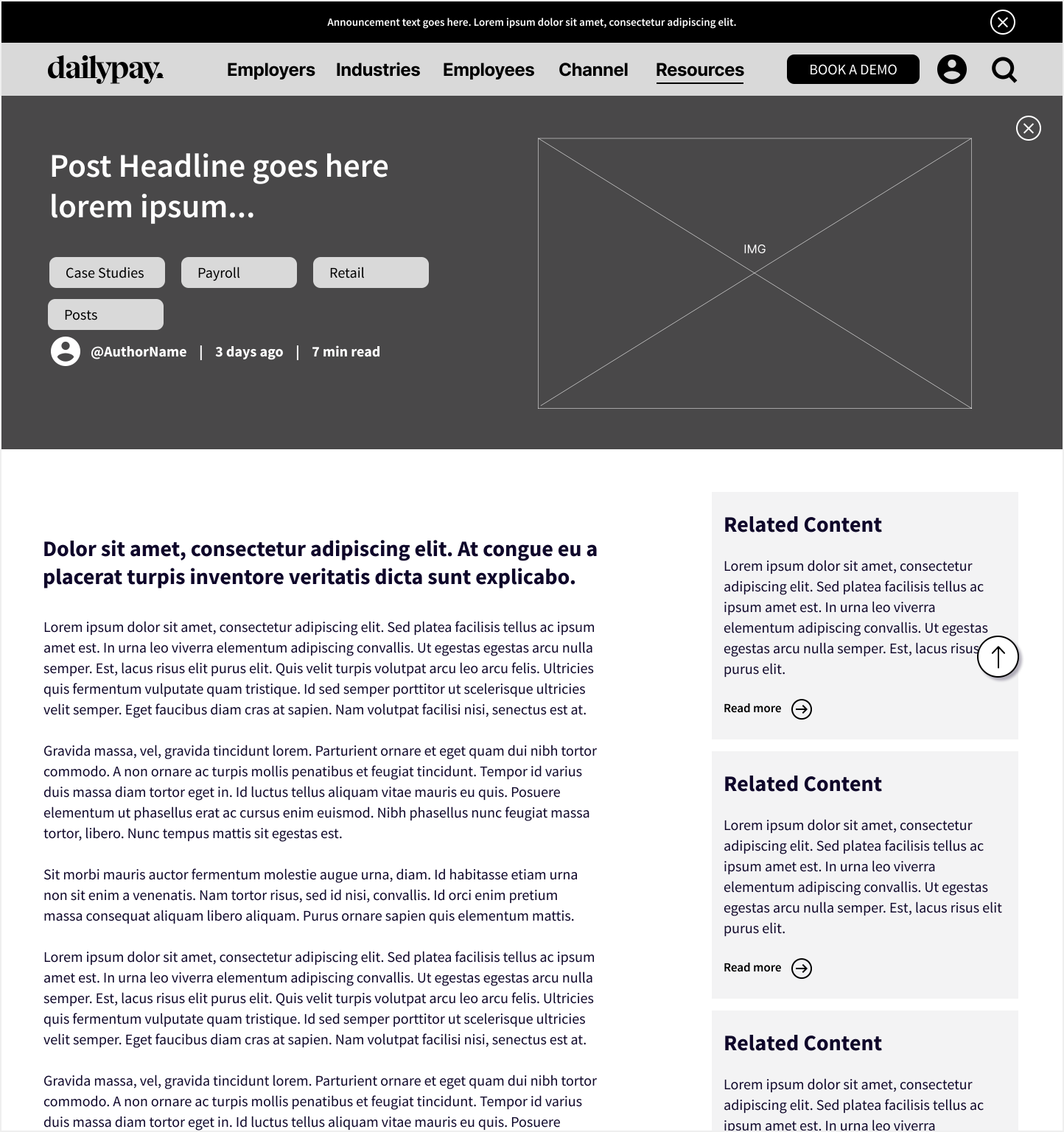
The old blog article page (left) had a text box that was stretched a little too wide for efficient reading and an unnecessary right rail—it housed an inconsistent word cloud and a defunct email capture. The redesign (right) offers a scannable layout with the emphasis on the content.
A growing collaboration
Over the span of four months, our team grew and so did the list of collaborators.
The project started with the request from the B2B team. We worked closely with them to identify the core personas and the topics relevant to their industries.
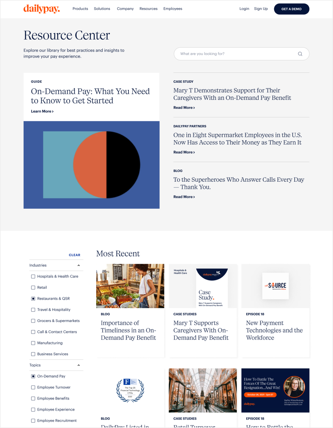
Part of the major upgrade in the redesign was the addition of the filter menu that allows the user to select multiple criteria to refine their content search. Our development team collaborated with a former developer who built the previous resource center to integrate the filtration logic. The process gained good momentum until it hit a few coding mishaps that led to delaying the launch date.
The Web Team, part of the larger Studio Team, is in constant collaboration with Content and our SEO consultant. It was through conversations with the Content Director that we learned how crucial the filter menu is for her team as part of their research process.
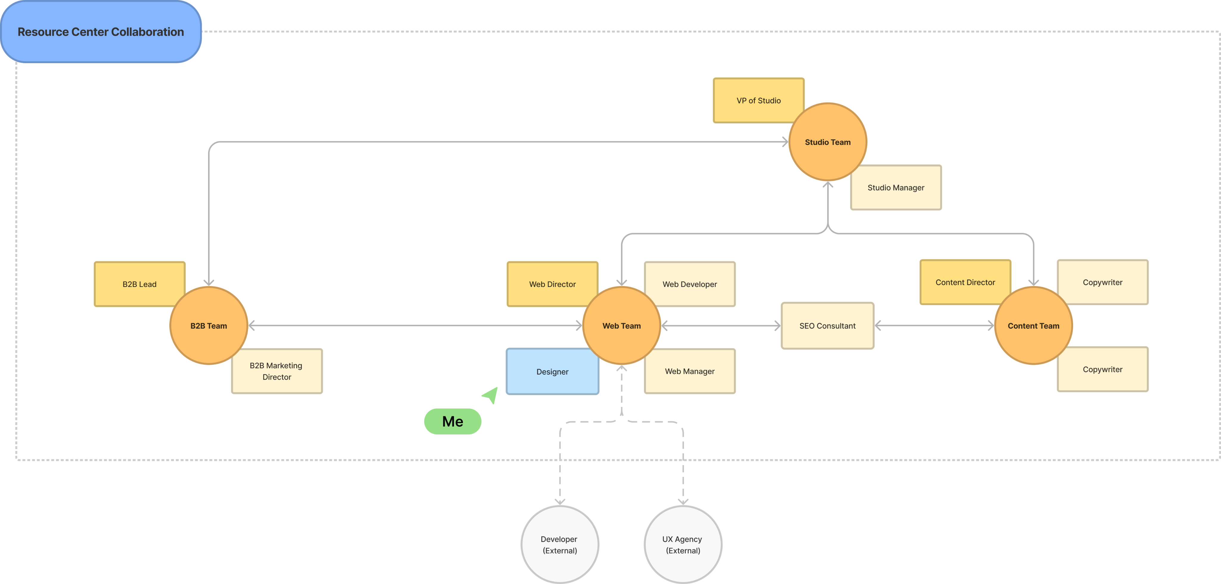
As the team expands, the resource center evolves.
Key Results
In the two months following the relaunch of the resource center, we saw an improvement in its user engagement. The overall page views increased by 75% with an increase of 89% for the average time spent on blog article pages, the main chunk of content on the resource center.
Takeaways
While the redesign of the resource center presented itself with a number of surprises, we landed on a product that I am particularly proud of.
We took the bugs and glitches discovered along the way as learnings to improve on the subsequent iterations of the hub. Taking content inventory at the beginning would reduce some of the questionable filtered results. Involving the Content Team earlier would lend insights into how they interact with the resource center so that we would consider their use cases in the process.
Sample of proposed visual guidelines for graphic assets. The color palette explores our secondary color palette alongside illustrations.
Next Steps
An ever-evolving hub
Once the redesign and updated templates were in place, we shifted our focus to the visual updates as the next phase. The illustration library began to expand and color coding assets were explored before team restructuring placed an indefinite hold on future releases on the project.
Six months post-launch, our team consulted an external UX agency to support a larger project as we aligned with the growth of the company. While the focus was to refresh product-related pages, some recommendations were provided for an improved resource center.
The Resource Center overview page as propsed by the external agency (left) was suggestive of the pre-redesign version with the tabbed navigation. A similar pattern would be mirrored onto the article page level (right) for a quicker navigation to the keyword-tagged content.
One of which was to reintroduce the tabbed navigation. While this provided a focused path for the user of where they are and where else they can go, it had shortfalls of customization for the different audiences (including an unexpected one*) using the hub.
*The unexpected audience using the Resource Center — and with the most heavy usage — was our Content Team. Published assets are often referenced when generating new ones, so the filter menu allowed them to tailor their research.
While we kept the recommendations in mind, there were incoming stakeholder requests that pushed our thinking forward for further iterations:
- Content packages tailored to specific industry needs to support the implementation process
- An event-centric destination where we can engage with the users at the various touchpoints of an event life cycle
- A defined hub for DailyPay’s media brand to build up more of the company’s thought leadership