Stoa
Storage solution helping power users to a simpler digital life.
Role
Research / Strategy / Design / User testing
Overview
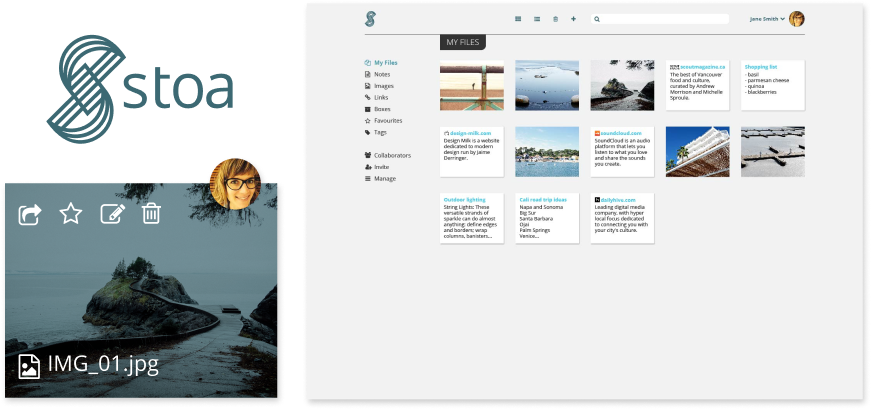
Stoa is a cloud-based file storage service providing a collaborative environment for file managing and content sharing. The company’s aim is to provide users a seamless way to categorize and access everything from browser bookmarks to word documents anywhere.
The Problem
Users were looking for a cloud storage service that offered more control over file managing and content sharing.
The Solution
With my role as the product designer, I was involved with all the stages of the design process: research, UX/UI design and user testing. The result is a multi-platform SaaS web app that allows users to store files online, access them from anywhere and collaborate with others.
View prototype >User Research
A survey was shared through social media to help determine the target market. From that, a selected number of users were interviewed to further understand their frustrations and experience with similar file-storage applications.
The users voiced their frustrations on their current limitations in digital content-sharing. They favour an multi-device friendly application that allows them to access their work files from home.
Users are keen on limiting digital clutter. Features such as collaborating in real-time with colleagues and the ability to collaborate during online presentations are desired.
The data was organized through personas that guided the design process. They not only act as tools to ensure I was designing for the users’ needs but also avoid the risk of creating a feature-bloated product.
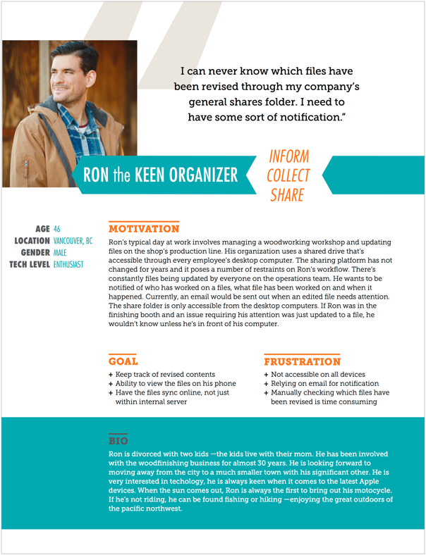
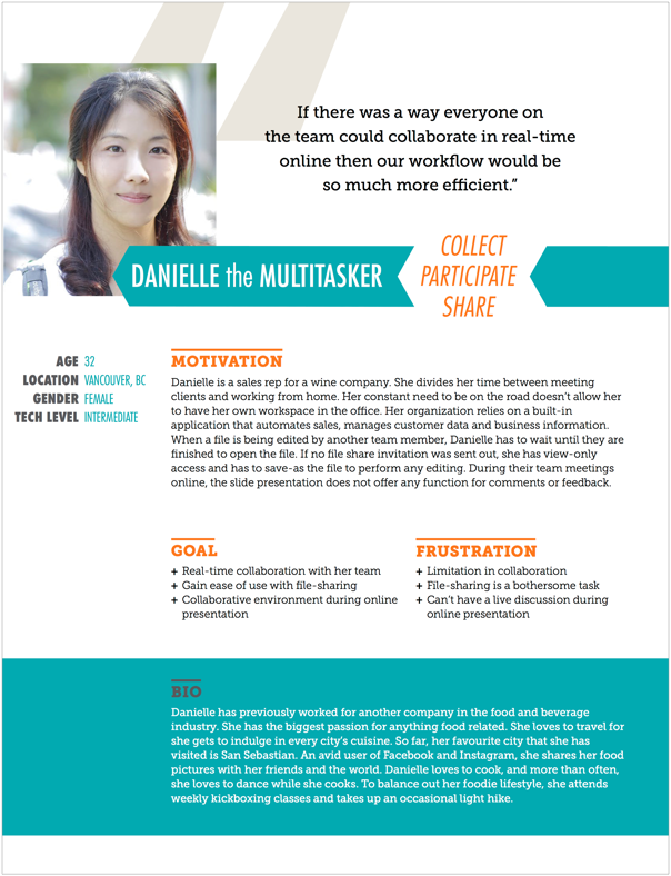
User personas reflecting the data from research.
A competitive analysis was conducted based on four other cloud-based storage systems: Dropbox, Google Drive, OneDrive, and Evernote. All offer the ability to save, organize and share content for collaborating. While Dropbox has no limitations in file size uploads, it does not allow for an entire folder upload through its web application. Google Drive comes with a generous 15GB of free storage, but it’s shared amongst the email inbox and other apps within its online suite. OneDrive also offers generous free storage, but like Google Drive it requires an email account associated with its service. Evernote has a smart and easy-to-use way of creating text-based notes, but it only allows for two devices to be used simultaneously under one account. Given the research, I was able to determine my product should be multi-device friendly with a simple uploading process and streamlined for sharing and collaborating.
User Stories & User Flows
User stories were created to help me determine and prioritize the minimum viable product features to focus on both new and returning users. A list of ideas for additional features were also created as suggestions for future releases. These included the ability to collaborate on real time with a chat function as well as switching between multiple accounts.
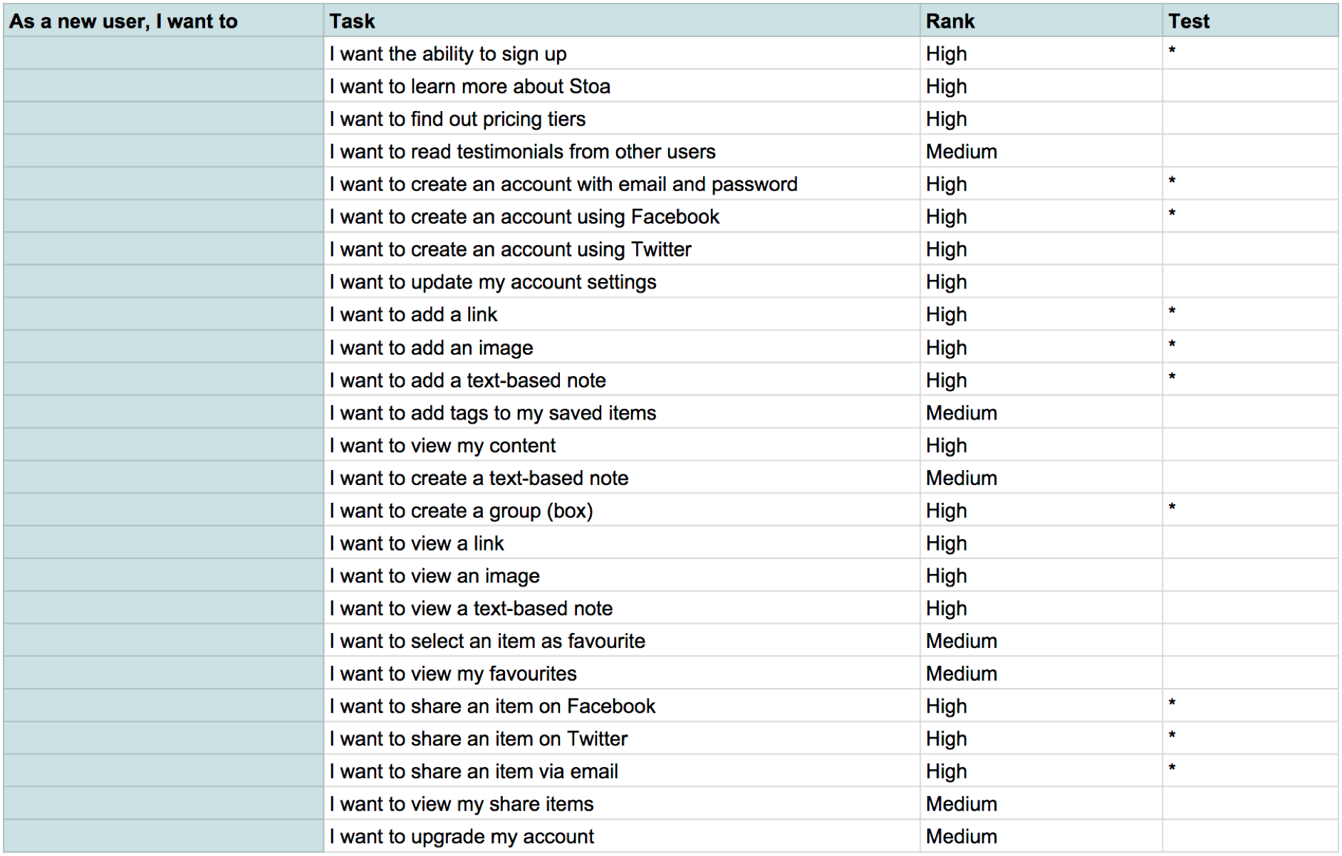
User stories helped determine which features to focus on.
Setting up the user flows really helped me define the steps taken to complete the actions fluidly. I learned where certain tasks can be simplified to avoid any unnecessary confusion for the user.
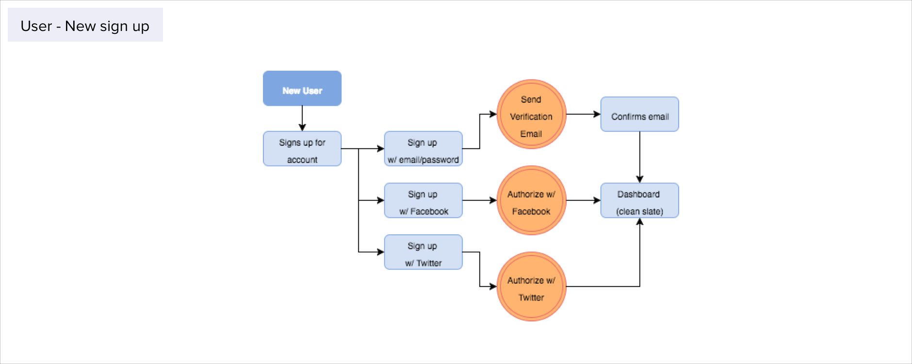
User flow of account sign up.
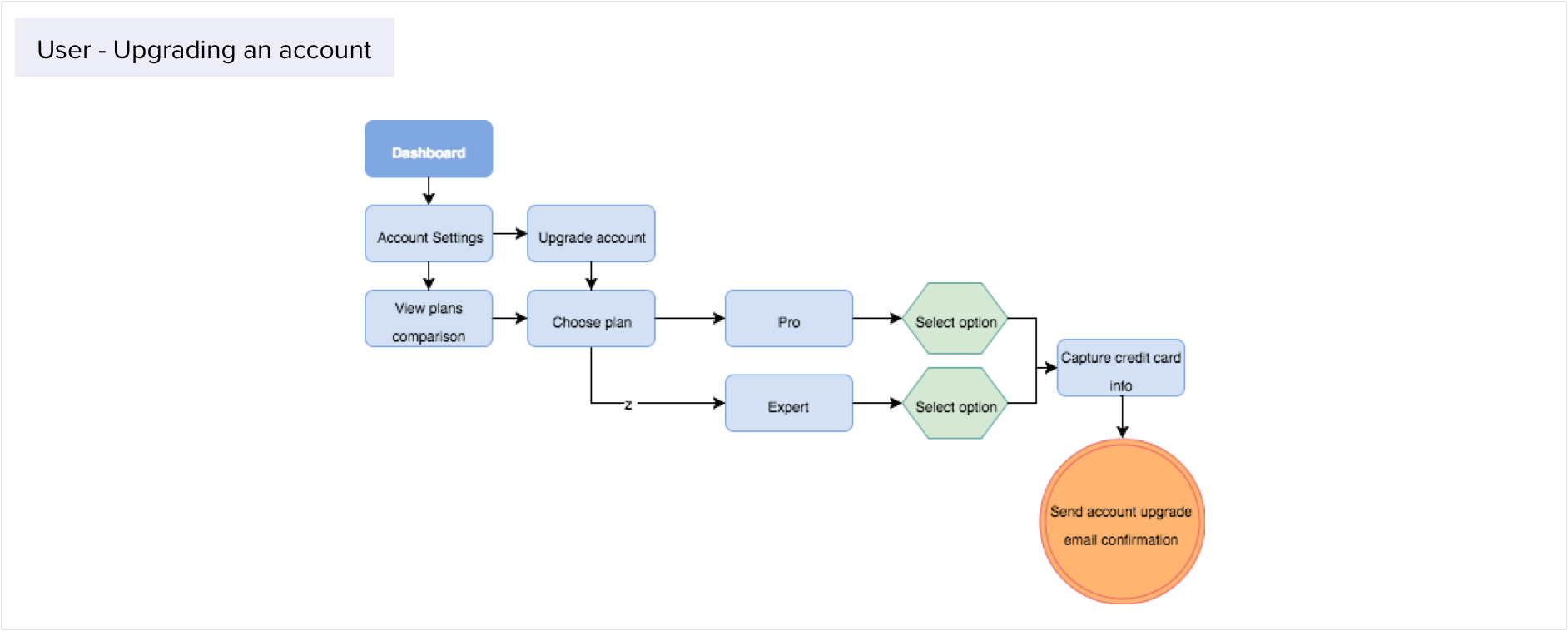
User flow of account upgrade.
Wireframes, Mockups & User Testing
With my hi-fi wireframes, I had the opportunity to test the sign-up process. All responses from the user group was similar, where they experienced no issues leading up to the dashboard page.
While in dashboard, a number of issues were discovered. The group was asked to create a text-based note, however, due to crowded navigation in the dialog box and unclear CTAs to complete the task users were left confused and frustrated. I took this feedback and separated the CTAs from the other clickable icons. This gave more breathing space to the CTAs, creating the needed focal point.
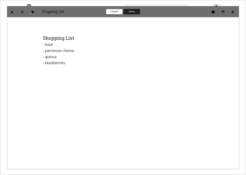
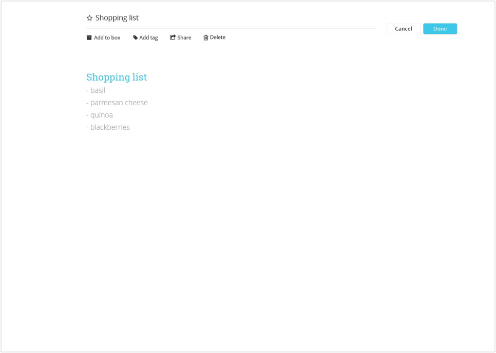
Creating a text-based note (from left): Lo-fi wireframe, hi-fi mockup.
When viewing a selected content, clickable areas and CTAs were not placed in consideration of the screen view as an overall. The CTA for closing the dialog box was far too small; many of the users struggled. Again, I repositioned the CTA to the side on it’s own so it draws the eye.
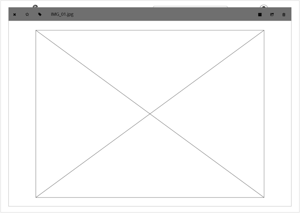
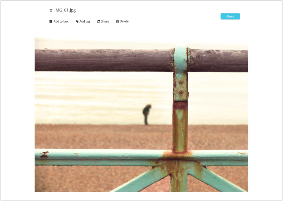
Viewing an image content (from left): Lo-fi wireframe, hi-fi mockup.
The dashboard has also gone through several iterations on it’s own before landing on the mockup version. The top navigation bar was the focus here. Initially, it wasn’t designed in consideration of the amount of the space it was taking up without providing much function other than negative space. The final design is condensed and utilizes the space as a main navigation system to the side menu bar.
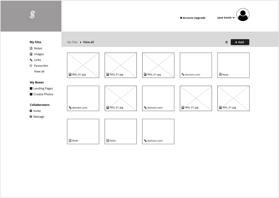
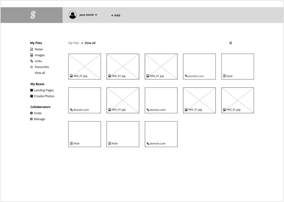
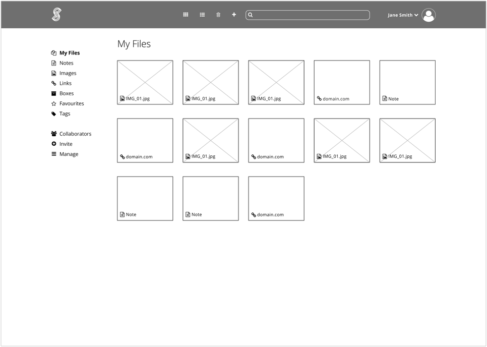
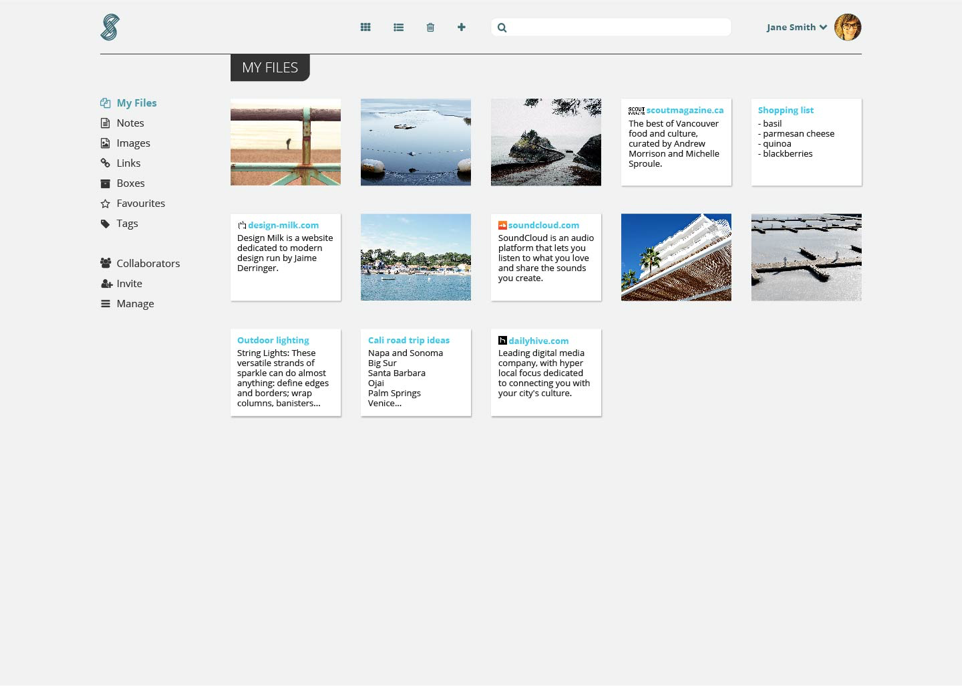
Dashboard iterations from wireframes to final mockup.
Creating the Brand
With an understanding of the platform and its audience, the brand identity was created to capture the essence of the application. Stoa mirrors its definition as a place where social gatherings took place with all types of communications exchanged during the ancient Greece period. The logo abstracts the structural forms surrounding this historical architectural feature.
The colour palette would need to reflect the credibility and reliability of the application. The selected varying shades of teal serves to support the brand’s identity.
The type system utilizes Open Sans as the body copy for its sans-serif friendliness and easy-to-read open curves. With its block-like appenditures, Roboto Slab is applied to headlines to express the brand’s solidity and confidence.
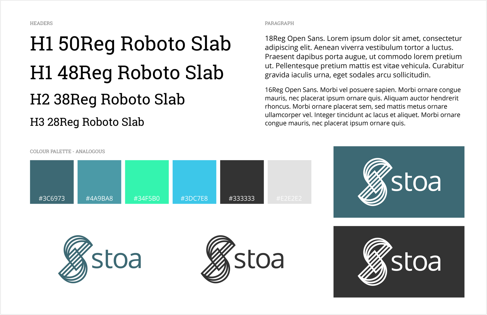
A visual system displaying the color palette and type scale.
Prototype
With adjustments on the issues emerged through the wireframes, a final usability test was performed to ensure the user flows were logical.
It was beneficial to have performed several tests in the beginning stages. A number of design feature flaws were overlooked and I was able to iron out a number of these issues before testing the prototype.
View prototype >Reflection
With Stoa, I learned the importance of responsive design. Initially, I was challenged by designing for web-only and not thinking about mobile-first. Not having done so set up roadblocks where I had to redesign layouts so the pages would flow seamlessly across devices of all sizes. In turn, this ate up time where I could have put towards more usability testing.
I also learned how easy it is to overlook simple design features that is not user-friendly. Something that is designed to my satisfactory will not necessary be as accommodating when it’s placed in a functional environment. The series of user tests I did in the wireframing stages were the most helpful in setting the path.
Given more time, I would like to further develop the team collaborating feature. This was a frustration voiced through the user interviews. However, due to the limited time allowed for the project the feature was not realized. If possible, I would like to place the focus on a chat function built-in to the application to enhance team collaborating.